As the White Sox organizational rebuild continues to gain momentum and traction, there seems to be increased chatter that the Sox could, or should, possibly experiment with a re-branding of their logo and colors.
To preface all of this I need to say that there has not been any official word from the Sox or the media that this is going to happen. I have just seen more and more comments on Twitter in recent months from fans wondering if it’s time for the team to wipe the slate clean and change up the colors and logo. That debate suddenly piqued my interest.
I enjoy this discussion because I do think there is a lot that the Sox need to start doing in regards to marketing this new wave of players and next era of White Sox baseball. I’m actually going to write much more about that during the offseason, so stay tuned.
With that being said, I do not think a new logo and uniforms is the answer to that marketing question.
I do understand where people with this line of thinking are coming from. The idea of a rebrand to coincide with this new era is definitely an understandable point of view to have, and I do think there is an argument to be made for it.
My point here is that although a case can be made, a Sox rebrand just isn’t necessary in my opinion.
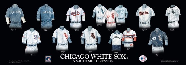
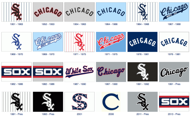
First of all, the White Sox current look with black, white and silver is the longest tenured brand in franchise history. The Sox started wearing black in 1991, and have stuck with that look for the last 26 years. Before that, the Sox bounced around with their brand, seemingly changing logos and uniforms every few years. The last few decades have seen brand stability previously unheard of with this franchise.
The White Sox have a plethora of throwback looks that they could (and already have) use for different occasions throughout the season. But none of their old looks lasted long enough, or were the face of enough sustained success, where you could argue switching back to them. That isn’t to say the Sox didn’t have some cool looks back in the day, just that none of them jump out at me as something that they need to bring back full time. I love how they wear the 80’s throwbacks on Sundays. That’s a perfect throwback idea to pay homage to the team’s history.
The Sox finally have some brand stability with their current look. It’s a look that our fans have really identified with too. “Good Guys Wear Black,” “Grinder Rules,” all of that. I think the black look just fits Sox culture really well. Not a ton of teams in baseball wear black, and none wear only black, so that makes it even more unique.
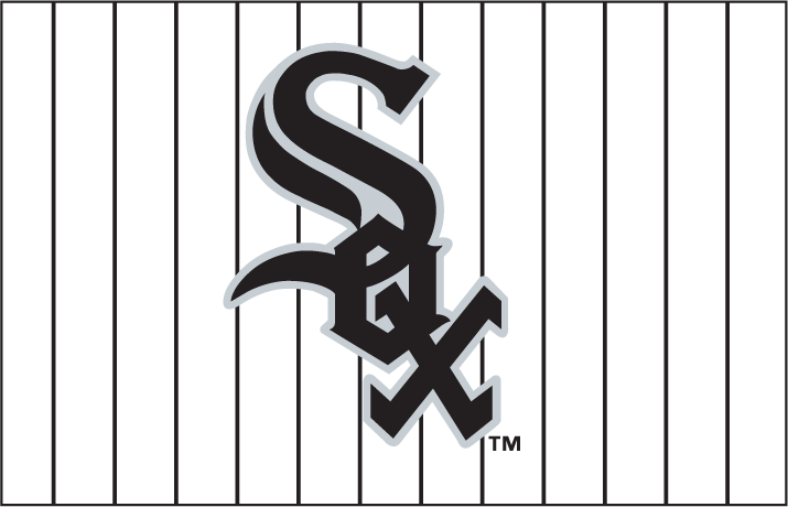
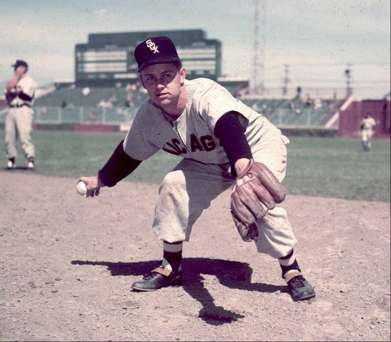
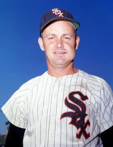
The script “SOX” logo is really, really cool. It’s unique, recognizable, and already a fixture in pop culture. You know it’s the Chicago White SOX when you see it. It also pays homage to the 1959 AL pennant winning Go-Go White Sox, who also had the script logo and pinstripe jerseys. So as much as the logo is a modern look, it also have a connection with the Sox rich history as a franchise.
Below are pictures from those 1959 “Go-Go” era White Sox. Notice the script “SOX” but also the block font “SOX” on the cap and block “CHICAGO” on the away jersey. It would be a pretty simple difference, while still staying faithful to the current look.
It’s also cool to be one of the few teams in baseball to still have pinstripes. I love the Sox home pinstriped jerseys (though I wish they would go back to the vests with black sleeves. Those were so nice). They are so clean, and just a classic home look.
The black alternates? Intimidating, and as they say, black goes with everything, right? They also match well with the team’s “Blackout” history as well. The Sox are one of five teams in the league that sport a black jersey.
Their road grays? Oh, you mean the uniform they won the World Series in? Those are just clean and simple road uniforms. Nothing more to be said!


What would a rebrand fix? Because if you’re going to spend money rebranding the team, changing all the logos, you better be damn sure there is a legitimate reason for it. Will it bring in more fans? Help us win more games? Absolutely not. We’ve seen time and time again that Sox fans will show up when a winning team is on the field, regardless of what uniform they’re wearing. Focus on fixing the team, don’t worry about the logos.
The White Sox don’t need to reinvent the wheel here. They already have a marketable brand (one that has lasted over 25 years!) that looks clean and simple. There is no reason for the Sox to jump off the deep end with their uniforms like the Diamondbacks did. Change just for the sake of change is stupid and unwise.
I think it’s also really important that we remember that the Sox won their first World Series in 88 years in these jerseys. That brand and accomplishment are locked together forever. I think when a team wins a title, the brand and logo that the have resonates with the memories fans make in that moment. Make no mistake, the black and silver absolutely still resonates with White Sox fans. It hasn’t gotten stale at all.
It’s a look that sets us apart from the Cubs and the rest of the league. The key now is how to market it better as this next era begins. Because consistency, and tapping into that connection with the current brand, could do wonders for the Sox in regards to fan engagement and experience.